Wednesday, May 20, 2009
FINAL TOMORROW!
Tuesday, April 7, 2009
Perspective Time
Wednesday, April 1, 2009
We are gearing up for our last few assignments!

Amelie Von Wulffen
click image to enlarge
Field trip/essay guidelines
Essay Guidelines:
Attend one or both of the scheduled field trips:
3PM SFMOMA Thursday April 2 and/or 5PM 49 Geary Thursday April 2
For SFMOMA: Board a Bart train for SF. Get off at the Montgomery Street Bart. It is the second San Francisco stop.
Head south on Montgomery Street toward Post Street. Turn right on Market then left on Third Street.
SFMOMA is at 151 Third Street. Wait outside at the ticket window. When in doubt ask for directions.
The museum is less than 1/2 a mile from the Bart station and a very popular attraction. See you at 3PM.
Directions available here.
For 49 Geary: Get off at the Montgomery Street Bart Station. Exit at Market Street and head UP toward
Third Street. Turn right on Geary walk up 400 feet and arrive at 49 Geary. See you at 5PM.
Map to 49 Geary here.
Choose one to three works of art by one artist on view at either SF MOMA or at one of
the galleries in the 49 Geary building. The goal of the essay assignment is to illustrate
how well you can identify and discuss a particular work of art employing the elements
and principles of design.
You MUST include a bibliography of at least 2 sources.
Online sources are acceptable as are exhibition catalogs. Using text, ideas, and images from
an article or book without properly giving credit can be construed as PLAGIARISM and
will result in an automatic F.
This is a double assignment, 8 points!
Please use a standard 12 point font, double spaced.
Essay must be 1 1/2 to 2 pages in length.
Refer to attached map for field trip details.
Refer to design vocabulary list for recommended terms.
Answer the questions below in your essay. Use color theory and design terms to present
your view point. DO NOT use the phrases “I like....” or “she/he did a good job.”
1. What is the artist’s name?
2. Where is the work being shown?
3. What materials did the artist use in making the art and what are the measurements?*
4. How does the artist use color and shape to achieve balance?
5. How does the artist use rhythm, shape and line to create a unified composition?
6. How has the artist employed pattern, repetition or texture?
7. Is there a focal point, an area of emphasis? If yes, what is it?
8. What do you think the artist is trying to communicate?
*extra information about the artist and artwork are often found at the front desk in galleries.
You may ask the receptionist for help. At the museum, wall text, audio tours,
and docents provide extra information. Also check out the museum bookstore and
GOOGLE your artist’s name. You may find that they have a website, blog, online articles, etc., that will help you write you essay.
Abstract Color Wheel/ DUE Thursday APRIL 9

Design an abstract composition using RADIAL SYMMETRY or UNITY WITH A GRID that includes every hue in the standard color wheel at least 2 times.
Radial Symmetry is found in nature. Imagine the petals of a flower, the rays of a star fish. Radial Symmetry is also found in many man made items, in the arts and technology such as the spokes of a wheel, the radial form of a mandala. Designs that use radial symmetry are balanced by the fact that they can be divided equally, at any angle, and unity is achieved through color, value and space.
Unity with a grid is used universally in design. Think of printed media, magazines, books, newspapers, even web pages use a grid to organize information. Hue (color), value, positive and negative space and shape are added to the mix to create an appealing, effective layout. Artists use the grid in textiles, painting and other creative ventures. Designs that use the grid to achieve unity are organized by the grid but rely on hue, value and shape for balance.
For your own unique “color wheel” use radial symmetry, or unity with a grid, combined with color and space or shape to achieve a balanced, appealing image. The elements that make up your design must be abstract, NOT representational. The composition must also reflect one other principle of design off the list below.
The Principles of Design:
unity Also know as harmony-Elements in an image look as though they belong together, and separate parts are viewed as a cohesive composition.
emphasis/focal point Prominence given to something in a composition.
scale/proportion Size and size relationships among elements in a compostion.
balance Distribution of visual weight within a composition
rhythm A sense of movement or direction created by repeated or similar hues, value, shape in a composition.
Please use a color wheel to ensure correct color matching. they are available in the bookstore or in class.
Reduced Value Protraits
Tuesday, March 3, 2009
reduced value study examples

Look carefully at this print by Andy Warhol.
Recognize how he has reduced the value severely
yet manages to retain realistic form.

We've all seen this collage by Shepard Fairey based on photograph
by AP photographer Manny Garcia. Look carefully at how Fairey
has reduced to value but managed to create an effective, even
iconic image of President Obama.
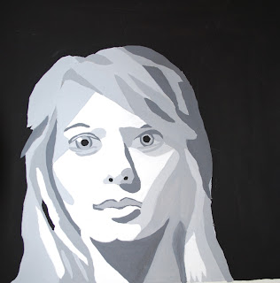
Take a portrait, your own, or of someone else and
focus on reducing the value down to white black
and 3 greys for your next painting project.
Here's a few more examples to inspire your work. One print by Vladimir Gorskey of Andy Warhol and 2 more prints of Marilyn by Warhol himself.


